 Колготки: чёрный список
 5 типов мужских носков и когда их носят
 Показатели качества колготок и носков, которые не печатают на упаковках
 Фильдеперсовые чулки
Pantone Color Institute Releases Fashion Color Trend Report Spring/Summer 2020 For London Fashion Week
Bold colour statements signal a determined desire for positivity and uplift
CARLSTADT, N.J., September 13, 2019 – Pantone LLC, global authority on colour and provider of professional colour standards for the design industries, today announced the Pantone® Fashion Color Trend Report Spring/Summer 2020 edition for London Fashion Week. Published for the fashion industry by the Pantone Color Institute, the trend forecasting and colour consultancy, this season’s report features the top 12 standout colours and current takes on the four classic neutrals we can expect to see on the runway as fashion designers introduce new spring/summer collections.
According to Pantone Color Institute’s colour experts, Spring/Summer 2020 London colours blends a palette of iconic favorites with seasonal neutrals to create a narrative of colour artistry. Taking a spontaneous colour approach through patterning and multi-coloured layers Spring/Summer 2020 colours highlight the continued desire for energetic contrasts and personalized self-expression, creating a rousing and robust colour story whose underlying message is determination and hopeful optimism.
Spring/Summer 2020 is a story of colourful expression, as we see bold hues — each strong enough to stand on their own — brashly coming together to create more provocative colour statements, — said Leatrice Eiseman, Executive Director of the Pantone Color Institute. — Strong and vibrant, this season’s colour palette displays our determined desire for positivity and uplift.
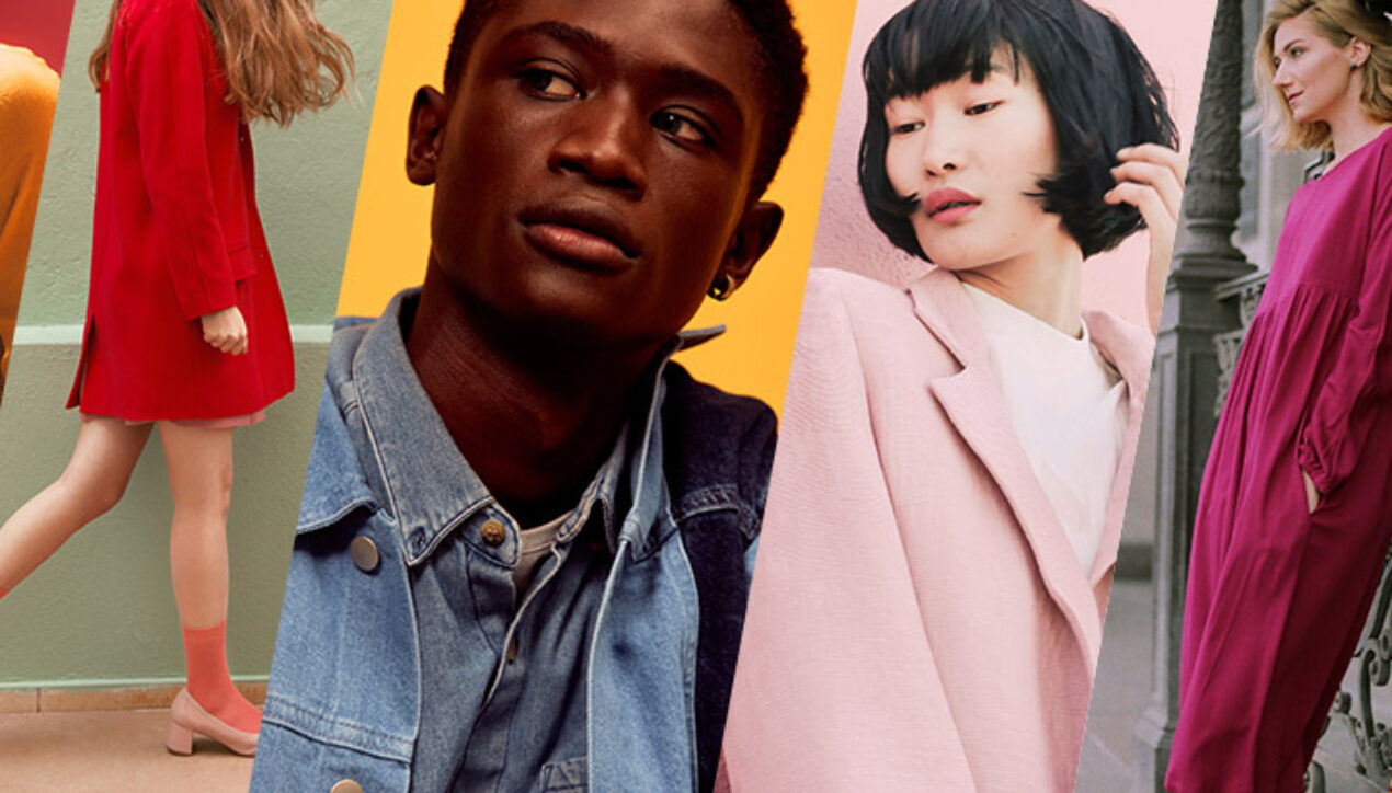
The Spring/Summer 2020 London Colour Palette
A rousing and robust palette for spring/summer 2020 reflects a continuing desire for energizing contrasts and personalized self-expression.
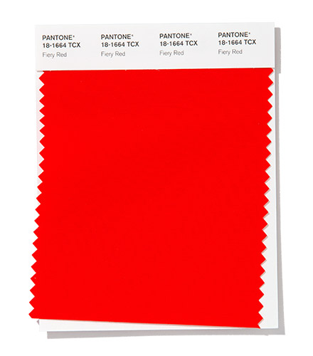
Emanating heat and energy, dramatic and dynamic Fiery Red is impossible to ignore.
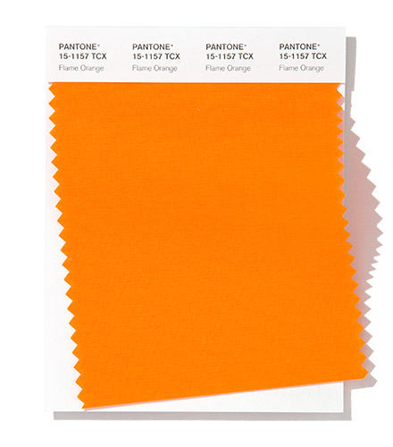
Linked to a radiant sunset, luminous Flame Orange positively glows.
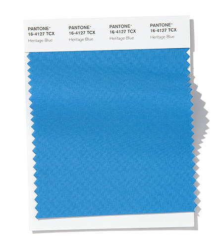
A time-honored blue hue Heritage Blue speaks of tradition, dependability and continuity.
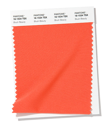
Blush Beauty engages, embraces and warms.
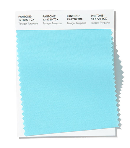
Tanager Turquoise cools with its soothing presence.
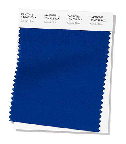
An expansive presence, Classic Blue is evocative of the vast and infinite evening sky opening a world of possibilities.
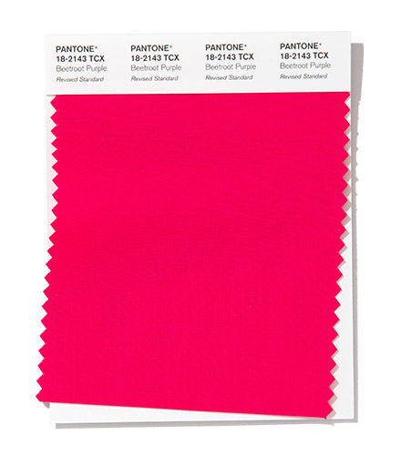
A startling and shocking fuchsia tone, Beetroot Purple tempts the eye.
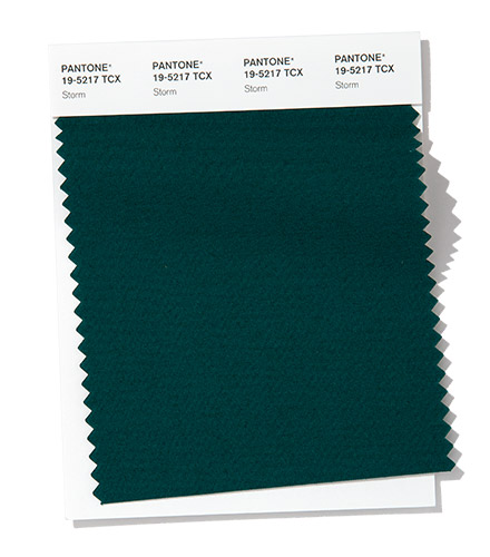
Storm captivates with its rich depth.
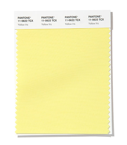
Eye catching Yellow Iris expresses positivity and optimism.
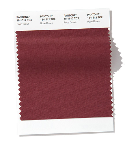
Warm and grounded, the full- bodied Rose Brown enriches both mind and body.
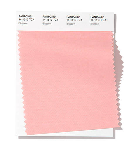
Blossom, a petal soft pink elicits an aura of romance.
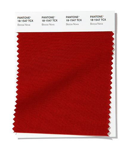
Upbeat Bossa Nova, is a pulsing and suggestive red with an earthy brown undertone.
The Spring/Summer 2020 Classics
A range of seasonal staples that can stand alone or serve as the foundation for personalized colour combinations.
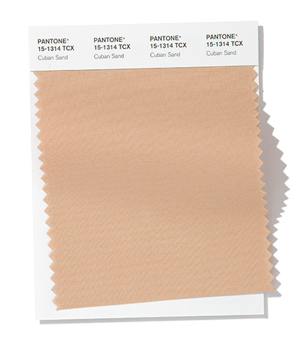
Cuban Sand’s inherent warmth nurtures and comforts.
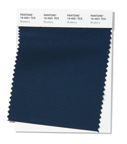
Blueberry, a thought provoking midnight blue implying an air of mystery.
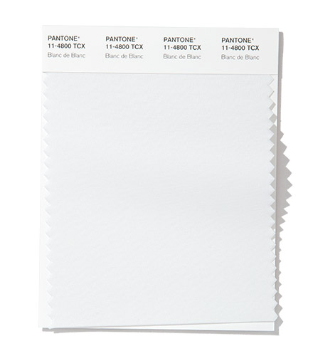
Blanc de Blanc is perceived as smooth, subtle and clarifying.
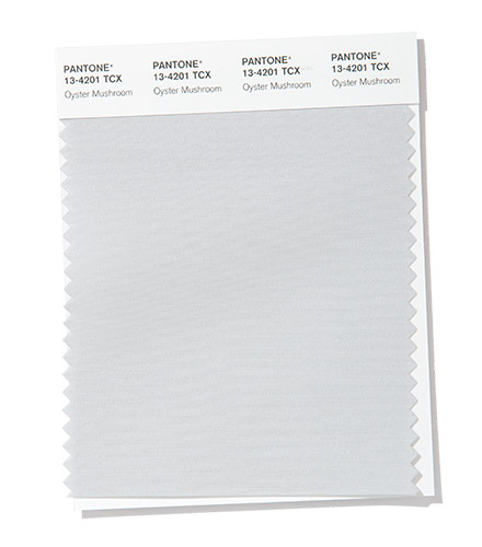
The pearl gray Oyster Mushroom exhibits a quiet strength.
About Fashion Color Trend Report
The colours featured in the semiannual Pantone Fashion Color Trend Report are selected from the Pantone FASHION, HOME + INTERIORS Colour System, the most widely used and recognized colour standards system for fashion, textile, home and interior design. Each season, the Pantone Color Institute issues the Pantone® Fashion Color Trend Report as semi-annual colour trend forecasts for the upcoming season, highlighting the top colours you can expect to see at New York Fashion Week and London Fashion Week. The Pantone® Fashion Color Trend Report serves as a colour reference throughout the season for fashion enthusiasts, reporters and retailers.
About The Pantone Color Institute™
The Pantone Color Institute is the business unit within Pantone that highlights the top seasonal runway colours, selects the Pantone Colour of the Year, forecasts global colour trends, and advises companies on colour for product and brand visual identity. Through seasonal trend forecasts, colour psychology, and colour consulting, the Pantone Color Institute partners with global brands to effectively leverage the power, psychology, and emotion of colour in their design strategy.
About Pantone
Pantone provides a universal language of colour that enables colour-critical decisions through every stage of the workflow for brands and manufacturers. More than 10 million designers and producers around the world rely on Pantone products and services to help define, communicate and control colour from inspiration to realization – leveraging advanced X-Rite technology to achieve colour consistency across various materials and finishes for graphics, fashion and product design. Pantone Standards feature digital and physical colour specification and workflow tools. The Pantone Color Institute™ provides customized colour standards, brand identity and product colour consulting as well as trend forecasting inclusive of Pantone Colour of the Year, Fashion Runway Colour Trend Reports, colour psychology and more. Pantone B2B Licensing incorporates the Pantone Colour System into different products and services, enabling licensees to communicate and reproduce approved Pantone values and improve efficiencies for their users. Pantone Lifestyle brings colour and design together across apparel, home, and accessories.
На пухлых ногах чулки выглядят вызывающе эротически. Чулкам на худых ногах сразу хочется читать стихи.
— Ирина Прибора
