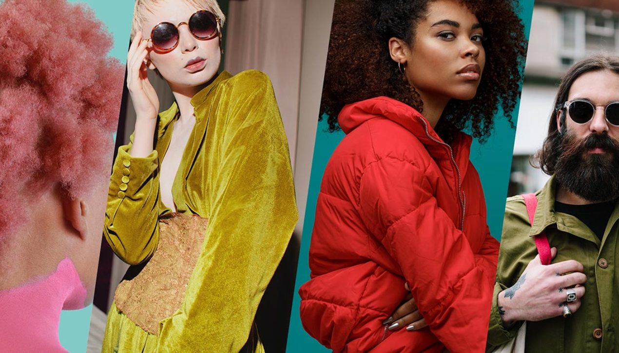
Pantone Color Institute Releases Fashion Color Trend Report Autumn/Winter 2019/2020 For London Fashion Week
A nuanced color story displays sophistication and empowerment
London, UK, February 15, 2019 – Pantone LLC, a global authority on colour and provider of professional colour standards for the design industries, today announced the Pantone® Fashion Color Trend Report Autumn/Winter 2019/2020 edition for London Fashion Week. Published for the fashion industry by the Pantone Color Institute, a trend forecasting and colour consultancy, this season’s report features the top 12 stand out colours, as well as current takes on the four classic neutrals we can expect to see from fashion designers on the runway as they introduce their new autumn/winter collections.
According to Pantone Color Institute’s colour experts, Autumn/Winter 2019/2020 colours reflect a new level of colour complexity; sophisticated and strong; a meaningful palette that empowers and instils confidence. Displaying endlessly varied combinations, colour stories exhibit a mix of nuances, creating the feeling of freedom to create one’s own personalised identity.
The colour story for Autumn/Winter 2019/2020 suggests rich tones, each capable of making a statement, but also with a versatility that creates warmth and harmony when paired together,” said Leatrice Eiseman, Executive Director of the Pantone Color Institute. “A sophisticated, yet bold collection of colours, this season’s palette exudes confidence and empowerment.
About the Autumn/Winter 2019/2020 London Color Palette
A nuanced palette for Autumn/Winter 2019/2020 reflects a new level of colour complexity; one that lends itself to endlessly varied combinations.
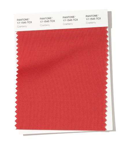
PANTONE 17-1545 Cranberry
Cranberry is a vital red that adds a pungent punch to the palette.
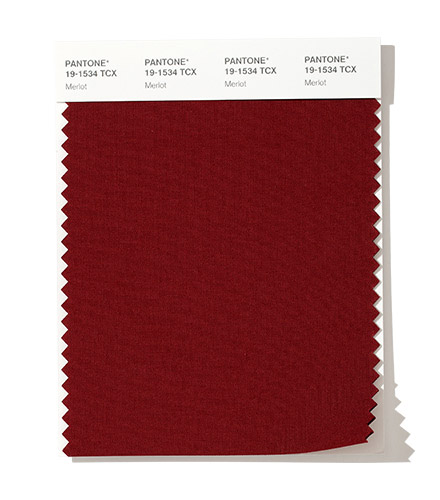
PANTONE 19-1534 Merlot
A fortifying wine shade Merlot display sophistication and depth.
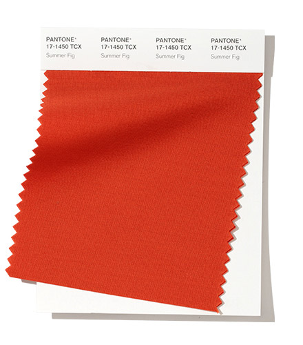
PANTONE 17-1450 Summer Fig
Rich in flavour, Summer Fig infuses a touch of exoticism to the fall palette.
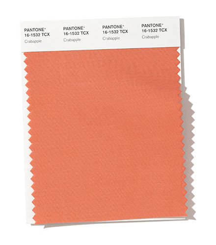
PANTONE 16-1532 Crabapple
Bringing warmth and comfort, orangey- rose Crabapple looks as though it were baked by the sun.
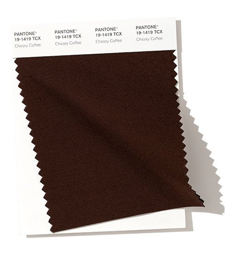
PANTONE 19-1419 Chicory Coffee
Robust and tasteful, Chicory Coffee introduces an element of heartiness.
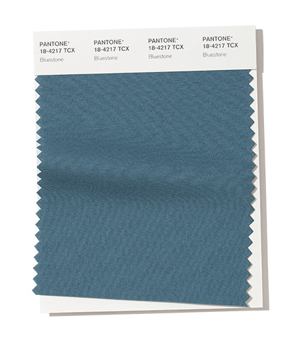
PANTONE 18-4217 Bluestonee
Bluestone is a colour of quiet resolve.
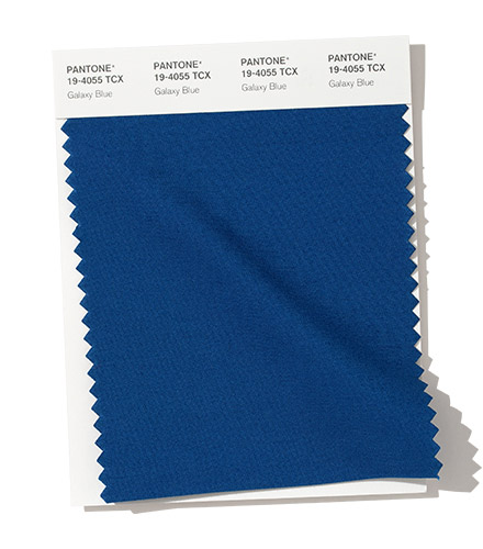
PANTONE 19-4055 Galaxy Blue
A thoughtful blue hue, Galaxy Blue is evocative of the greater galaxy.
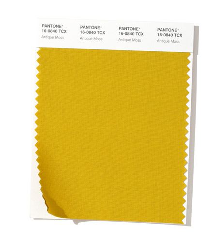
PANTONE 16-0840 Antique Moss
An arresting yellow-based green, Antique Moss displays sharp contrast to the autumn/winter colour palette.
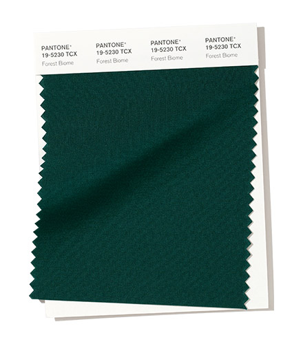
PANTONE 19-5230 Forest Biome
Forest Biome is a foresty green shade suggestive of the colour of autumn flora.
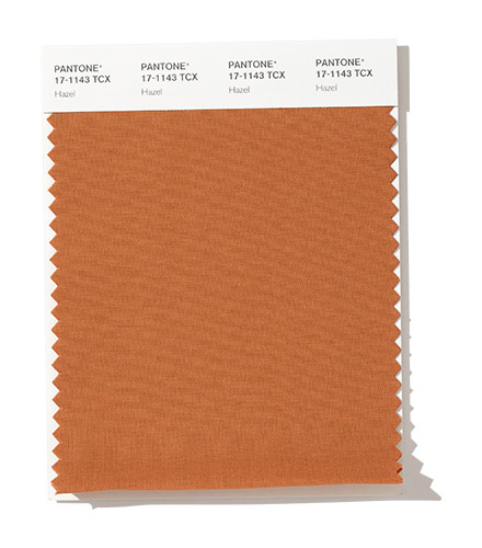
PANTONE 17-1143 Hazel
A mellow brown, Hazel is thought of as an organic natural tone.
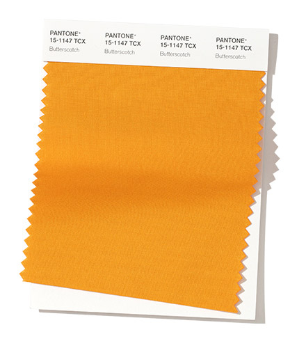
PANTONE 15-1147 Butterscotch
Butterscotch is a deliciously appealing golden yellow.
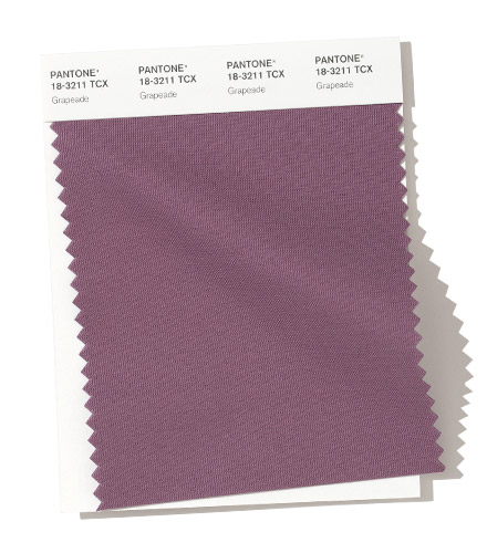
PANTONE 18-3211 Grapeade
The distinctive Grapeade is a notable muted mauve tone.
About the Autumn/Winter 2019/2020 Neutral Color Palette
Serving as a foundation, a range of seasonal staples that can stand alone or act as a contrast for individualised colour mixes.
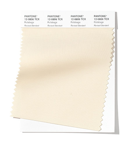
PANTONE 12-0806 Rutabaga
Rutabaga is a basic beige, both rooted and timeless.
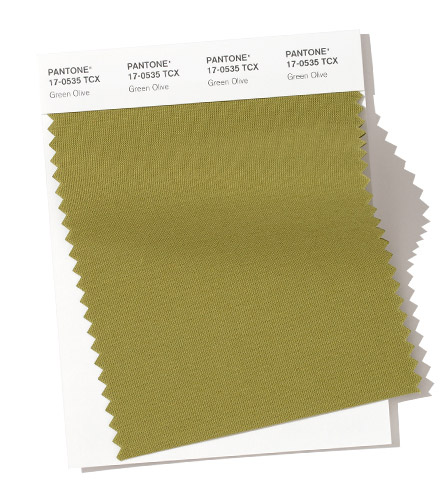
PANTONE 17-0535 Green Olive
A definitive olive, Green Olive sets the standard for green.
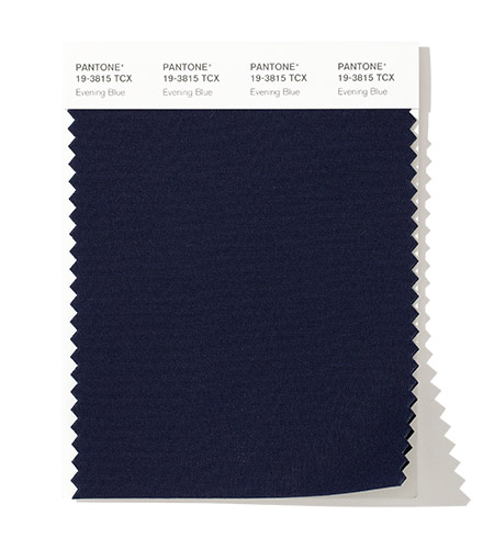
PANTONE 19-3815 Evening Blue
Confident and classic, a deep blue symbolic of the evening sky.
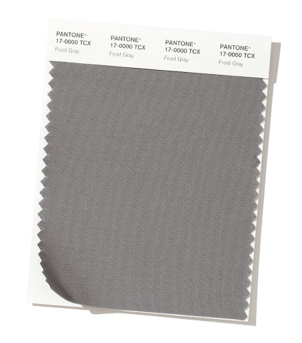
PANTONE 17-0000 Frost Gray
An eternal gray shade, Frost Gray conveys gravitas and stability.
About Fashion Color Trend Report
The colors featured in the semiannual Pantone Fashion Color Trend Report are selected from the Pantone FASHION, HOME + INTERIORS Color System, the most widely used and recognized color standards system for fashion, textile, home and interior design. Each season, the Pantone Color Institute issues the Pantone® Fashion Color Trend Report as semi-annual color trend forecasts for the upcoming season, highlighting the top colors you can expect to see at New York Fashion Week and London Fashion Week. The Pantone® Fashion Color Trend Report serves as a color reference throughout the season for fashion enthusiasts, reporters and retailers.
About The Pantone Color Institute™
The Pantone Color Institute is the business unit within Pantone that highlights the top seasonal runway colors, selects the Pantone Color of the Year, forecasts global color trends, and advises companies on color for product and brand visual identity. Through seasonal trend forecasts, color psychology, and color consulting, the Pantone Color Institute partners with global brands to effectively leverage the power, psychology, and emotion of color in their design strategy.
About Pantone
Pantone provides a universal language of color that enables color-critical decisions through every stage of the workflow for brands and manufacturers. More than 10 million designers and producers around the world rely on Pantone products and services to help define, communicate and control color from inspiration to realization – leveraging advanced X-Rite technology to achieve color consistency across various materials and finishes for graphics, fashion and product design. Pantone Standards feature digital and physical color specification and workflow tools. The Pantone Color Institute™ provides customized color standards, brand identity and product color consulting as well as trend forecasting inclusive of Pantone Color of the Year, Fashion Runway Color Trend Reports, color psychology and more. Pantone B2B Licensing incorporates the Pantone Color System into different products and services, enabling licensees to communicate and reproduce approved Pantone values and improve efficiencies for their users. Pantone Lifestyle brings color and design together across apparel, home, and accessories.
Чулки заметны даже под халатом. Они рождают аллюзии, отсылающие к Софии Лорен.
— Ирина Прибора

 Колготки: чёрный список
 5 типов мужских носков и когда их носят
 Показатели качества колготок и носков, которые не печатают на упаковках
 Фильдеперсовые чулки
