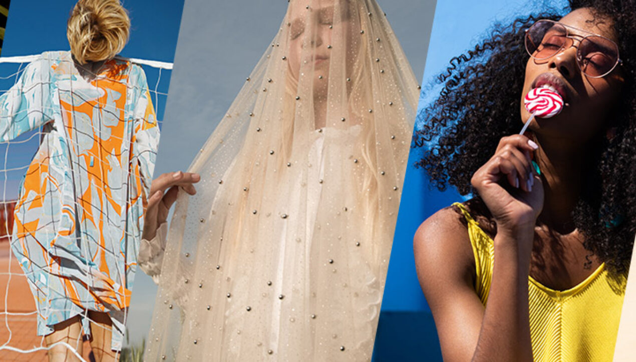
Pantone Color Institute Releases Pantone Fashion Colour Trend Report Spring/Summer 2021 For London Fashion Week
London, UK, September 17, 2020 — Pantone LLC, the global authority on colour and provider of professional colour standards for the design industries, today announced the Pantone Fashion Colour Trend Report Spring/Summer 2021 edition for London Fashion Week (LFW). Published for the fashion industry by the Pantone Color Institute, the trend forecasting and colour consultancy, this season’s report features the top ten standout colours as well as current takes on five core classics we can expect to see as fashion designers introduce new spring/summer collections.
Whilst surrounded by uncertainty in these indeterminate times, Spring/Summer 2021 colours for LFW highlight our need to immerse ourselves into a world characterized by colours that reflect hope and optimism, according to Pantone Color Institute’s colour experts. Combining a spirt of lightheartedness with functionality and flexibility, colours for Spring/Summer 2021 emphasize our desire for the pleasure and enjoyment color can bring to our lives.
«A range of floral hues reflective of gardens in springtime awakens our spirit, reinvigorating our interest in colour that inspires feelings of much needed optimism. Colours that are flexible and can work year-round, colours that amalgamate our desire for comfort and relaxation with energy and determination,» said Leatrice Eiseman, Executive Director of the Pantone Color Institute.
About the Spring/Summer 2021 London Colour Palette
Floral hues reflective of gardens in springtime paired with new core classics fuses a spirt of lightheartedness with functionality and flexibility.
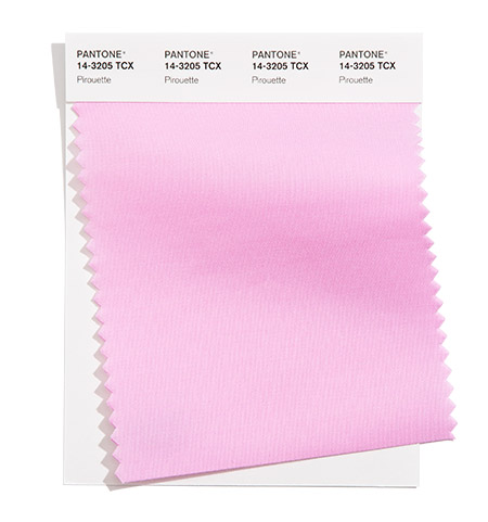
PANTONE 14-3205
Pirouette
A diaphanous pink adds a tender touch.
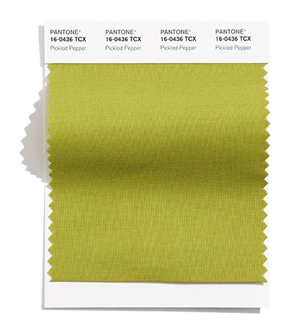
PANTONE 16-0436
Pickled Pepper
A garden variety green both mildly sweet and pleasantly tangy.
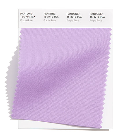
PANTONE 15-3716
Purple Rose
The mystical Purple Rose conveys a message of enchantment.
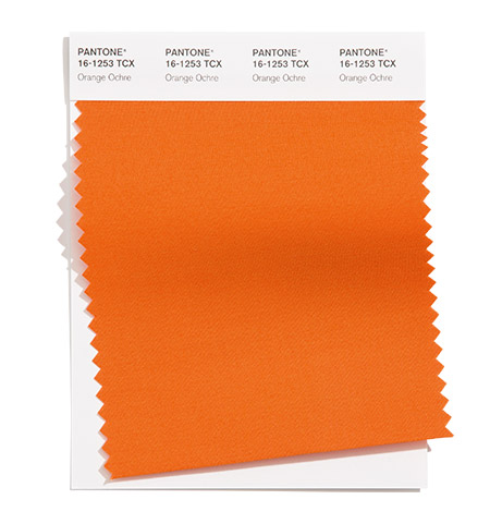
PANTONE 16-1253
Orange Ochre
This earthy orange transcends the seasons.
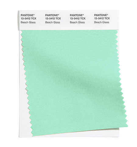
PANTONE 13-5412
Beach Glass
A watery aqua tumbled smooth by the waves and currents.
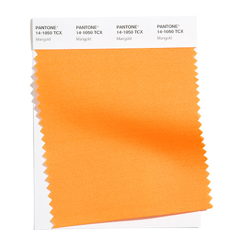
PANTONE 14-1050
Marigold
Marigold is a comforting golden orange infused yellow that lends a warming presence.

PANTONE 18-4250
Indigo Bunting
A brilliant blue with cheerful gusto, Indigo Bunting is emblematic of the all-blue male song bird.
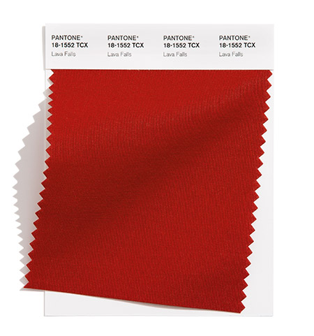
PANTONE 18-1552
Lava Falls
This hot molten red erupts with a flowing energy.

PANTONE 13-0647
Illuminating
Friendly and joyful, an optimistic yellow offering the promise of a sunny day.
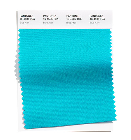
PANTONE 16-4535
Blue Atoll
Blue Atoll is suggestive of a tropical island in the sea.
The Spring/Summer 2021 Core Classics:
Core hues whose versatility transcends the seasons.
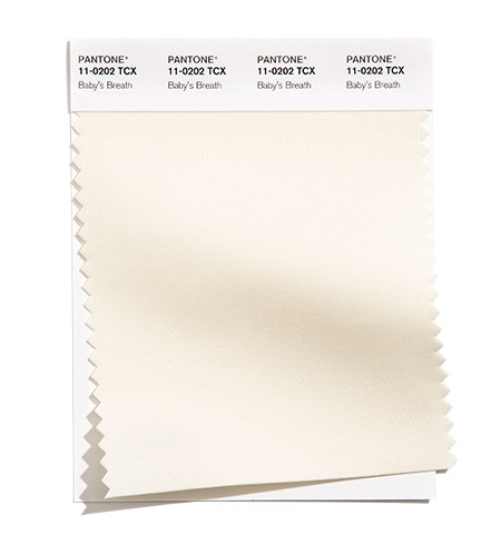
PANTONE 11-0202
Baby’s Breath
A tinted off-white lighter than air.

PANTONE 17-1221
Macchiato
Macchiato is a coffee with cream shade imbued with warmth.
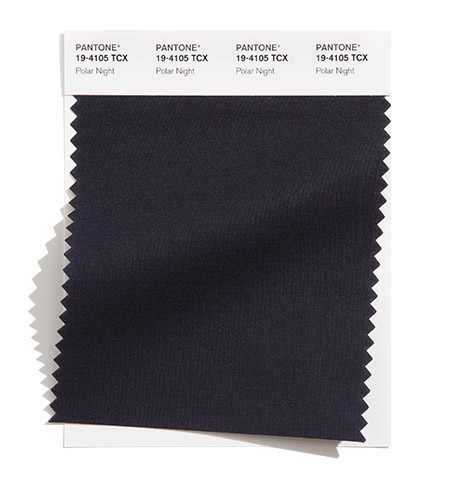
PANTONE 19-4105
Polar Night
A profoundly deep and restful twilight blue.
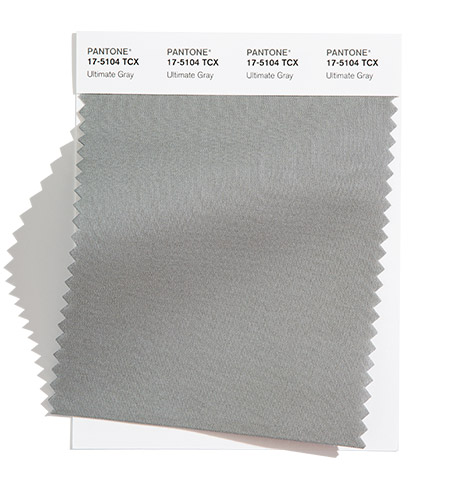
PANTONE 17-5104
Ultimate Gray
Quietly assuring and reliable, Ultimate Gray encourages composure.
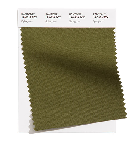
PANTONE 18-0529
Sphagnum
Mossy green Sphagnum carpets the ground with color.
Adobe Stock x Pantone Fashion Colour Trend Report
To support the PANTONE Fashion Colour Trend Report for Spring/Summer 2021 for London, Pantone has partnered with Adobe Stock to curate a collection of images that reflect the palette of 10 top fashion colours as well as 5 core classics. With millions of visual assets, Adobe Stock is an amazing resource for creatives to seek visual inspiration and creative development.
About Fashion Colour Trend Report
The colours featured in the semiannual Pantone Fashion Colour Trend Report are selected from the Pantone FASHION, HOME + INTERIORS Colour System, the most widely used and recognized colour standards system for fashion, textile, home and interior design. Each season, the Pantone Color Institute issues the Pantone® Fashion Colour Trend Report as semi-annual colour trend forecasts for the upcoming season, highlighting the top colours you can expect to see at New York Fashion Week and London Fashion Week. The Pantone Fashion Colour Trend Report serves as a colour reference throughout the season for fashion enthusiasts, reporters and retailers.
About The Pantone Color Institute™
The Pantone Color Institute is the business unit within Pantone that highlights the top seasonal runway colours, selects the Pantone Color of the Year, forecasts global colour trends, and advises companies on colour for product and brand visual identity. Through seasonal trend forecasts, colour psychology, and colour consulting, the Pantone Color Institute partners with global brands to effectively leverage the power, psychology, and emotion of colour in their design strategy.
About Pantone
Pantone provides a universal language of colour that enables colour-critical decisions through every stage of the workflow for brands and manufacturers. More than 10 million designers and producers around the world rely on Pantone products and services to help define, communicate and control colour from inspiration to realization – leveraging advanced X-Rite technology to achieve colour consistency across various materials and finishes for graphics, fashion and product design. Pantone Standards feature digital and physical colour specification and workflow tools. The Pantone Color Institute provides customized colour standards, brand identity and product colour consulting as well as trend forecasting inclusive of Pantone Color of the Year, Fashion Runway Colour Trend Reports, colour psychology and more. Pantone B2B Licensing incorporates the Pantone Colour System into different products and services, enabling licensees to communicate and reproduce approved Pantone values and improve efficiencies for their users. Pantone Lifestyle brings colour and design together across apparel, home, and accessories.
Одежда не изменит мир, это сделают женщины, которые её носят. И иногда все начинается с чего-то столь простого, как правильная пара носков.
— Томми Хилфигер

 Колготки: чёрный список
 5 типов мужских носков и когда их носят
 Показатели качества колготок и носков, которые не печатают на упаковках
 Фильдеперсовые чулки
