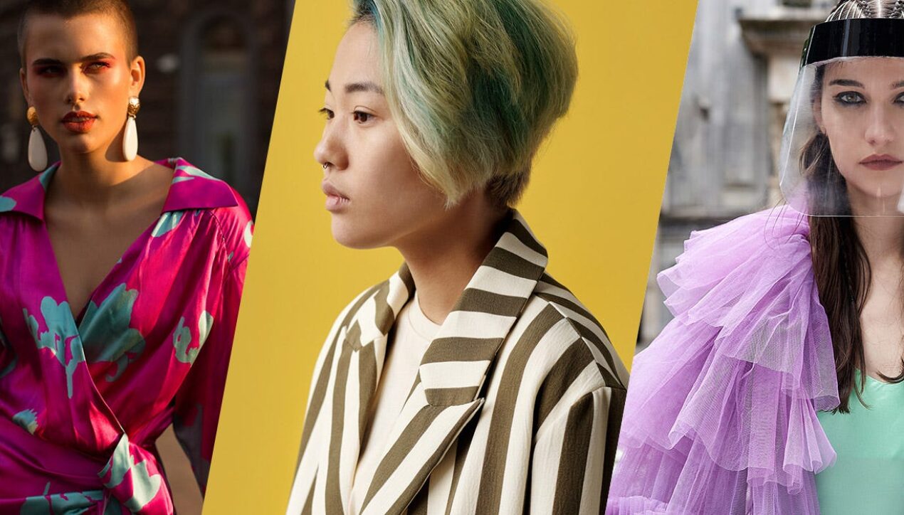
Pantone Color Institute Releases Pantone Fashion Colour Trend Report Spring/Summer 2022 For London Fashion Week
A PALETTE OF COLOUR THAT FUSES OUR NEED FOR GROUNDING AND SIMPLICITY WITH OUR DESIRE FOR UNINHIBITED SELF-EXPRESSION AND BREAKING THE BOUNDARIES
London, UK, 16 September 2021 — Pantone LLC, the global authority on colour and provider of professional colour standards for the design industries, today announced the Pantone Fashion Colour Trend Report Spring/Summer 2022 edition for London Fashion Week (LFW). Published for the fashion industry by the Pantone Color Institute, the trend forecasting and colour consultancy, this season’s report features the top ten standout colours as well as current takes on five core classics we can expect to see as fashion designers introduce new Spring/Summer collections.
Promoting new sentiments of simplicity and spontaneity, colours for LFW Spring/Summer 2022 fuse our deep connection to nature and need for comfort and familiarity with lighthearted airy pastels and visually arresting brights. Capturing this theme of complement and contrast, these colours inspire playful creativity and unconstrained expression that is full of life.
«Our use of colour is connected to the cultural mood. As we explore a new future, we are looking for opportunities to do something completely different,» said Leatrice Eiseman, Executive Director of the Pantone Color Institute. «Colours that celebrate our desire to break the boundaries satisfy our fervent need for the playful creativity and unconstrained visual expression we are seeking as we enter into this time».
About the Spring/Summer 2022 London Colour Palette
Blending sentiments of simplicity and spontaneity inspires new forms of personalised expression
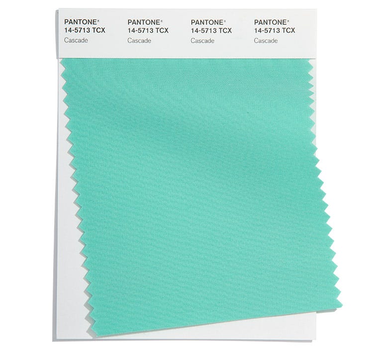
PANTONE 14-5713
Cascade
Connected to cleansing waters, dreamy Cascade cools and refreshes.
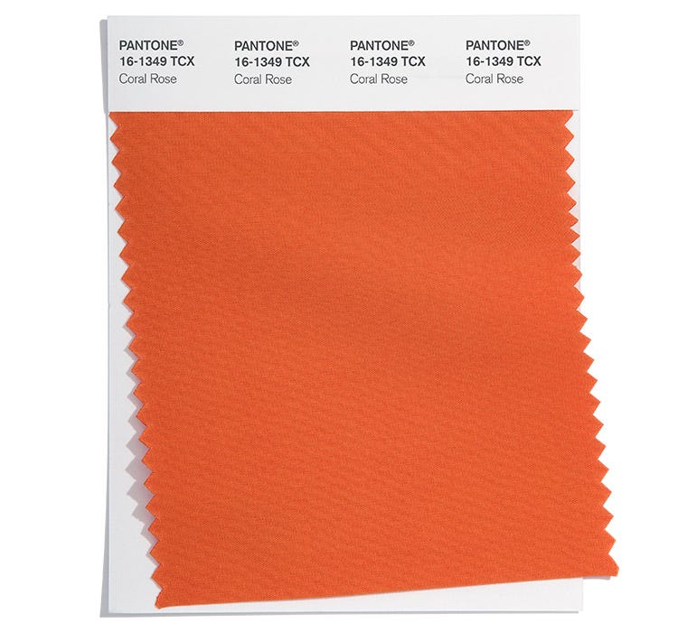
PANTONE 16-1349
Coral Rose
Vivid Coral Rose is a floral tone whose energising presence brings a sense of uplift.
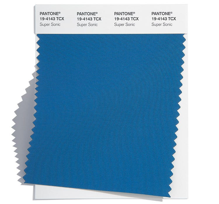
PANTONE 18-4143
Super Sonic
Vibrant Super Sonic is electric in intensity.
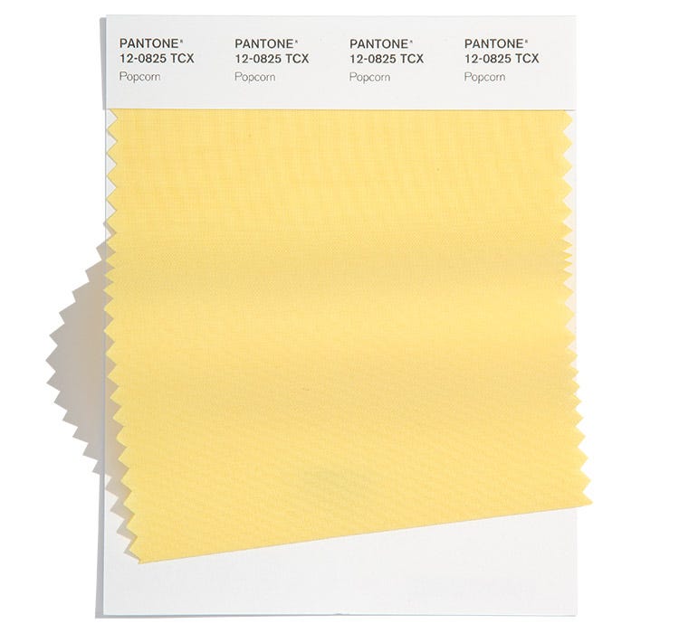
PANTONE 12-0825
Popcorn
Bright and cheery Popcorn radiates warmth to all who embrace it.
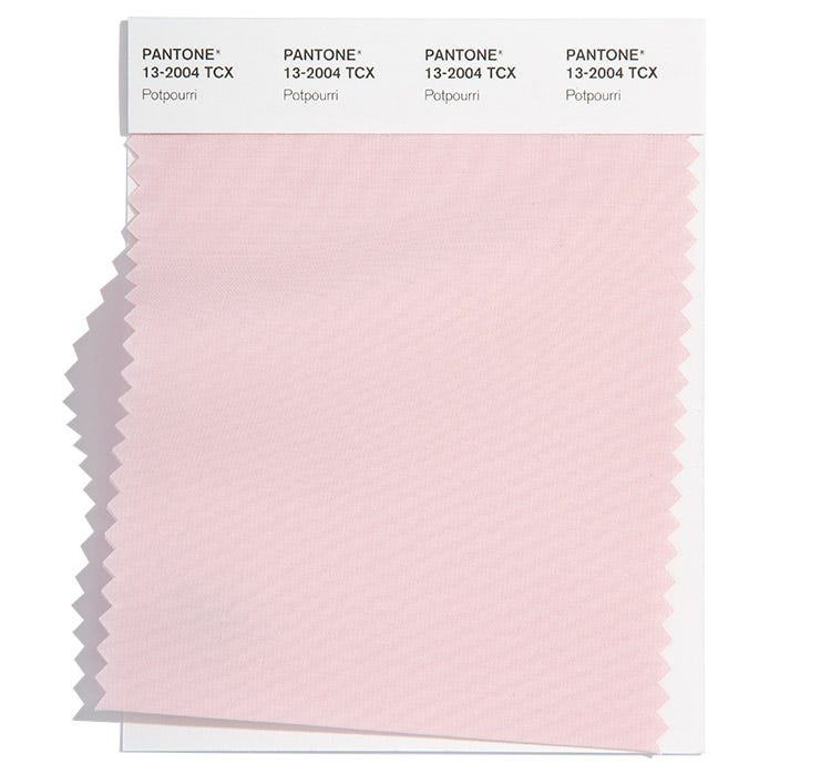
PANTONE 13-2004
Potpourri
Potpourri is a lighthearted and carefree fresh pastel pink.
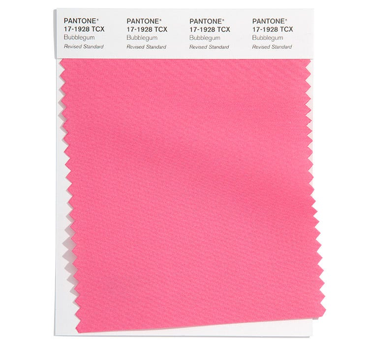
PANTONE 17-1928
Bubblegum
Eye-catching Bubblegum sends a message of playfulness and positivity.
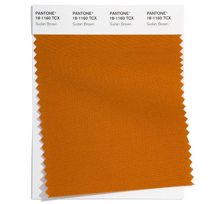
PANTONE 18-1160
Sudan Brown
Sudan Brown is a naturally rich earth-baked brown tied to the great outdoors.
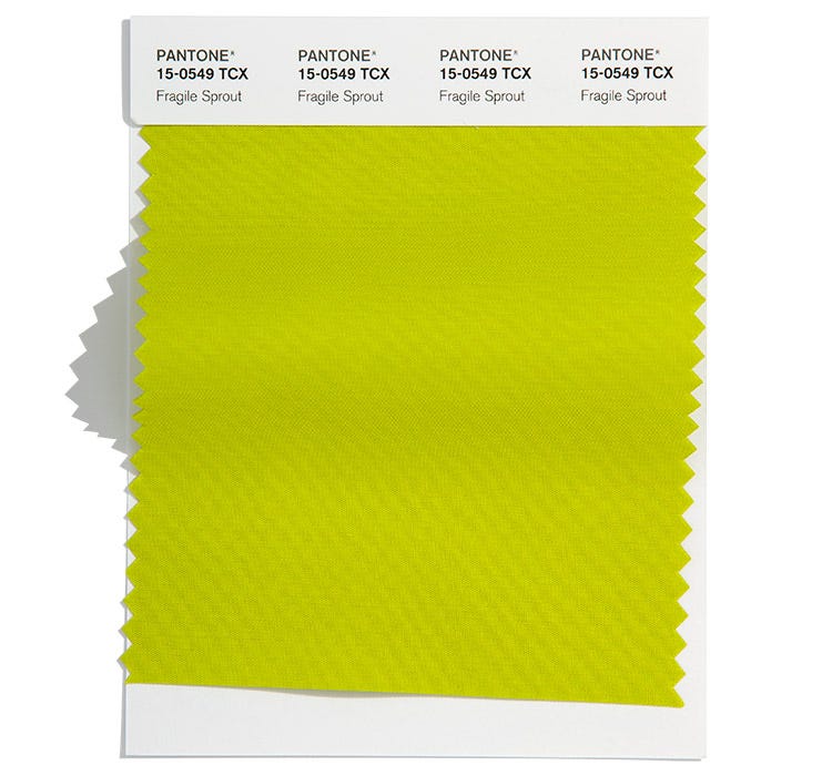
PANTONE 15-0549
Fragile Sprout
Sharp and acidic Fresh Sprout is visually arresting.
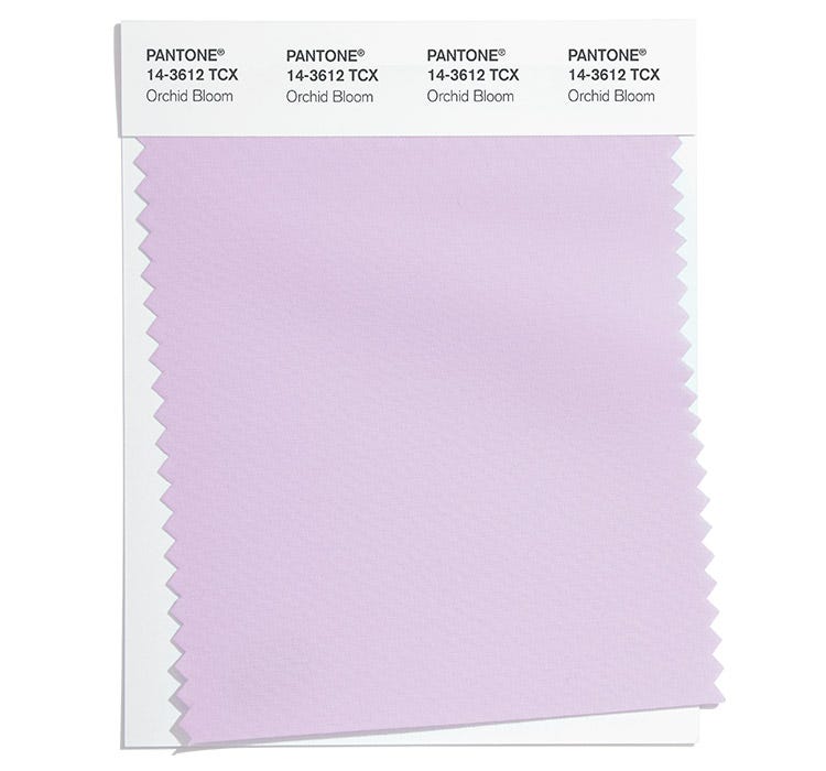
PANTONE 14-3612
Orchid Bloom
Orchid Bloom is reminiscent of our heightened love of nature’s florals.
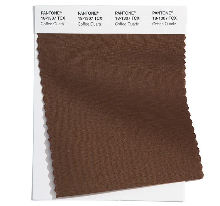
PANTONE 18-1307
Coffee Quartz
A flavourful brown that touches on both the basic and the glamourous.
About the Spring/Summer 2022 Core Classics
Classic, seasonless hues whose versatility express longevity.
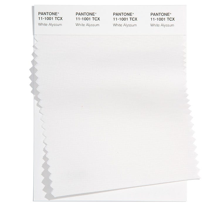
PANTONE 11-1001
White Alyssum
Clean and clarifying White Alyssum cuts through the chaos, addressing our desire for easy and effortless simplicity.
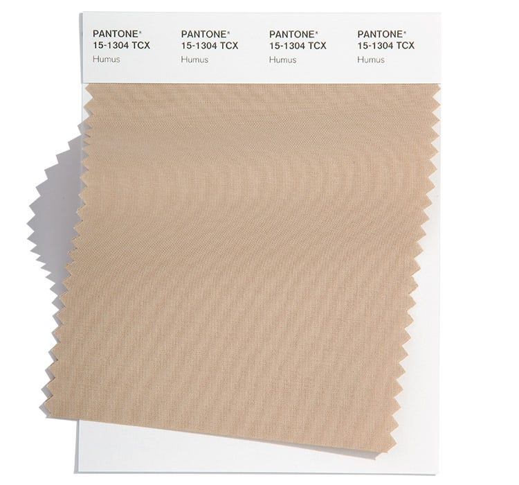
PANTONE 15-1304
Humus
Tasty humus, a pragmatic classic promotes a comforting mood of well-being.
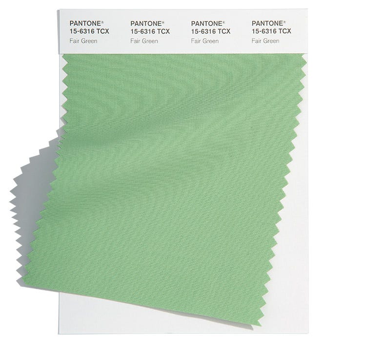
PANTONE 15-6316
Fair Green
Fair Green is a calming and restorative restful green.
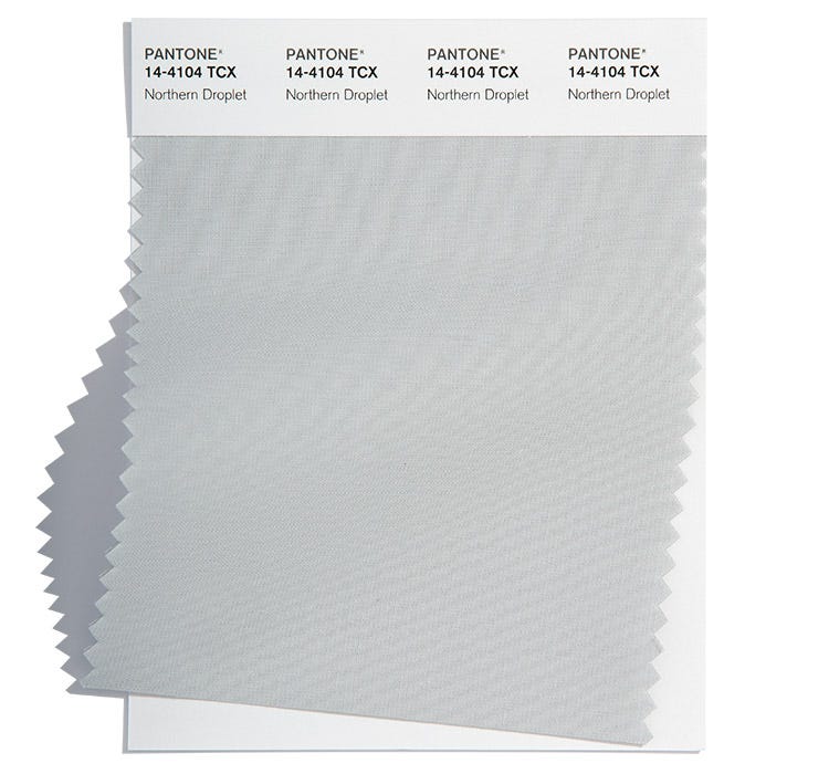
PANTONE 14-4104
Northern Droplet
Northern Droplet is a pale grey that instills feelings of tranquility.
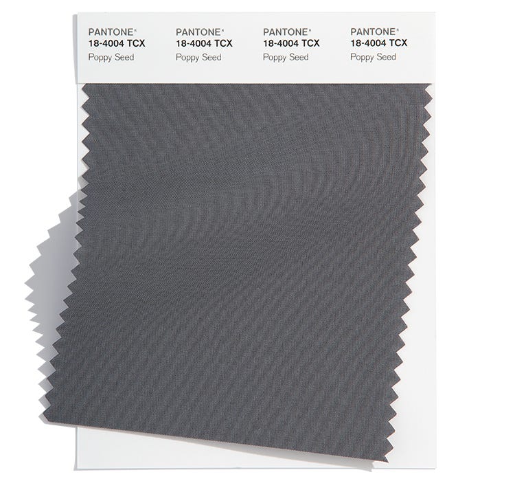
PANTONE 18-4004
Poppy Seed
The silent power of deep grey Poppy Seed contains timeless familiarity.
Adobe Stock x Pantone Fashion Colour Trend Report
To support the Pantone Fashion Colour Trend Report for Spring/Summer 2022 for New York and London, Pantone has partnered with Adobe Stock to curate a collection of images that reflect the palette of 10 top fashion colours as well as 5 core classics. With millions of visual assets, Adobe Stock is an amazing resource for creatives to seek visual inspiration and creative development. Click here to view the Adobe Stock x Pantone Colour Trend Report Gallery.
About Fashion Colour Trend Report
The colours featured in the semiannual Pantone Fashion Colour Trend Report are selected from the Pantone Fashion, Home + Interiors Colour System, the most widely used and recognised colour standards system for fashion, textile, home, and interior design. Each season, the Pantone Color Institute issues the Pantone Fashion Colour Trend Report as semiannual colour trend forecasts for the upcoming season, highlighting the top colours you can expect to see at New York Fashion Week and London Fashion Week. The Pantone Fashion Colour Trend Report serves as a colour reference throughout the season for fashion enthusiasts, reporters, and retailers.
About The Pantone Color Institute™
The Pantone Color Institute is the business unit within Pantone that highlights the top seasonal runway colours, selects the Pantone Color of the Year, forecasts global colour trends, and advises companies on colour for product and brand visual identity. Through seasonal trend forecasts, colour psychology, and colour consulting, the Pantone Color Institute partners with global brands to effectively leverage the power, psychology, and emotion of colour in their design strategy.
About Pantone
Pantone provides a universal language of colour that enables colour-critical decisions through every stage of the workflow for brands and manufacturers. More than 10 million designers and producers around the world rely on Pantone Products and Services to help define, communicate, and control colour from inspiration to realisation – leveraging advanced X-Rite technology to achieve colour consistency across various materials and finishes for graphics, fashion, and product design. Pantone Standards feature digital and physical colour specification and workflow tools. The Pantone Color Institute provides customised colour standards, brand identity, and product colour consulting, as well as trend forecasting inclusive of Pantone Color of the Year, Fashion Runway Colour Trend Reports, colour psychology, and more. Pantone B2B Licensing incorporates the Pantone Colour System into different products and services, enabling licencees to communicate and reproduce approved Pantone Values and improve efficiencies for their users. Pantone Lifestyle brings colour and design together across apparel, home, and accessories. Connect with Pantone on Instagram, Facebook, LinkedIn.
About X-Rite
Founded in 1958, X-Rite Incorporated is a global leader in the science and technology of colour and appearance. With Pantone, X-Rite employs more than 800 people in 11 countries. The company’s corporate headquarters are located in Grand Rapids, Mich., with regional headquarters in Europe and Asia and service centers across Europe, the Middle East, Asia, and the Americas. X-Rite offers a full range of solutions used by manufacturers, retailers, printers, photographers, and graphic design houses to achieve precise management and communication of colour and appearance throughout their processes. X-Rite products and services are recognised standards in the printing, packaging, photography, graphic design, video, automotive, paints, plastics, textiles, and medical industries. For further information, please visit www.xrite.com. For the latest news, information, connect with X-Rite on LinkedIn, Twitter, and Facebook.

London Fashion Week Spring/Summer 2022
Надетые чулки хорошо смотрятся с узкой юбкой, на высоком стуле или в глубоком кресле. Снятые чулки лучше положить в ванную, в корзину для белья.
— Ирина Прибора

 Колготки: чёрный список
 5 типов мужских носков и когда их носят
 Показатели качества колготок и носков, которые не печатают на упаковках
 Фильдеперсовые чулки
